2.3 Principles of Design for AP3D
4 min read•june 18, 2024
S
Sherry Ross
AP Art & Design 🎨
18 resourcesSee Units
Principles of Design: AP3D
These are essentially the same as the principles of design for AP2D, but they are represented differently because of the 3D elements and the way you photograph the art.
The photos provided are all the work of a talented teacher and artist, Gabe Dorrego. He is allowing us to use them to help you understand these principles:
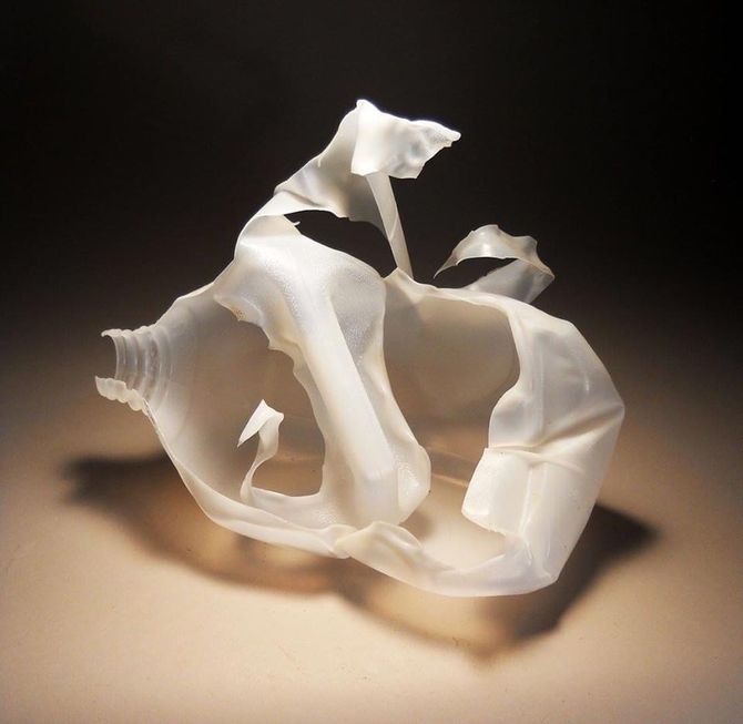
Opacity/Transparency—The degree to which design objects can be seen through.
This is a simple exercise using a milk jug, scissors, and a heat gun. Note how the opacity and transparency are manipulated with lighting and the shadows become an important part of the piece. See the section on how to photograph your artwork, as well. 😉 🙌🏽
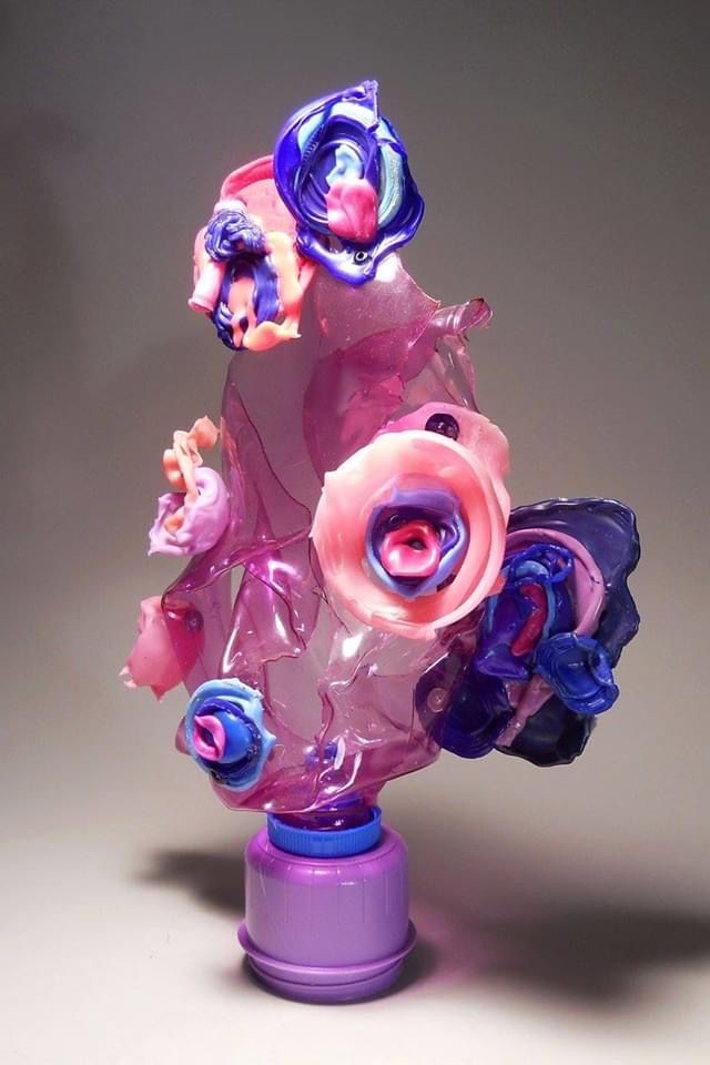
Value/Contrast—Value is the level of lights and darks in a color, like light blue versus dark blue. Contrast is the intensity of that difference.
A limited color range, blue and pink, is extended in the piece below through the use of value and contrast.
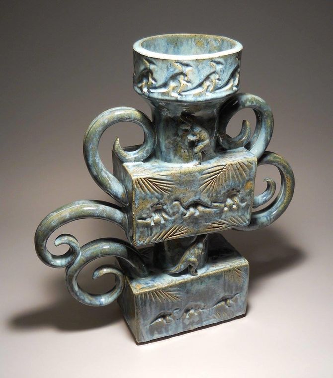
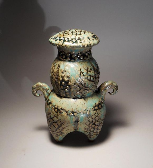
Time —How do the element(s) change over time or implied time?
The forms shown here imply classical (ancient) forms, but then are changed dramatically to make it seem more up to date or even a bit futuristic. This uncertainty is further compounded by the use of glazes that seem to create an aged patina on the piece. This is one way to deal with time in a 3D work.
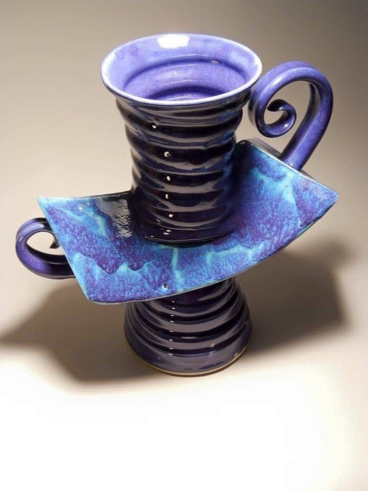
Rhythm—The spaces between elements can create a pattern or a rhythm between elements through varying their spacing or sizing.
The undulations in the form below create a rhythmic pattern that moves the eye up the form.
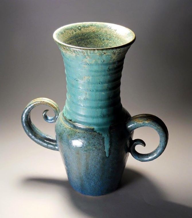
Movement— To create the illusion of movement in all or part of a work, or the path that your eye takes across the picture plane.
Here, the light ridges, curling handles and gently expanding form all work together to move the eye upward.
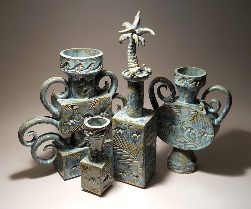
Proportion/Scale—Scale is how the various elements of the piece work in relationship with each other. Proportion is the relative size of different parts within an object.
In this photo, you can analyze the use of both proportion and scale. You can note the relative sizes of this grouping and see how they SCALE in comparison to each other. Then you can look at the PROPORTION of the handles to the bodies or the bases.
Balance—There are three types of balance: symmetrical, asymmetrical, and radial.
- Symmetrical—also known as mirror balance. Exists when objects on either side of the picture plane have equal visual weight.
- Asymmetrical—when objects on both sides of the picture plane, while having different sizes or numbers, still create a visual balance.
- Radial—when objects create a pattern extending outward (radiate) from a center point either there or implied.
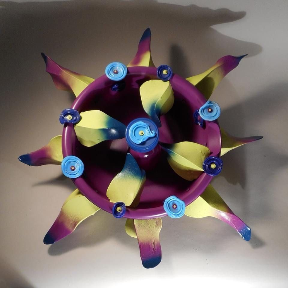
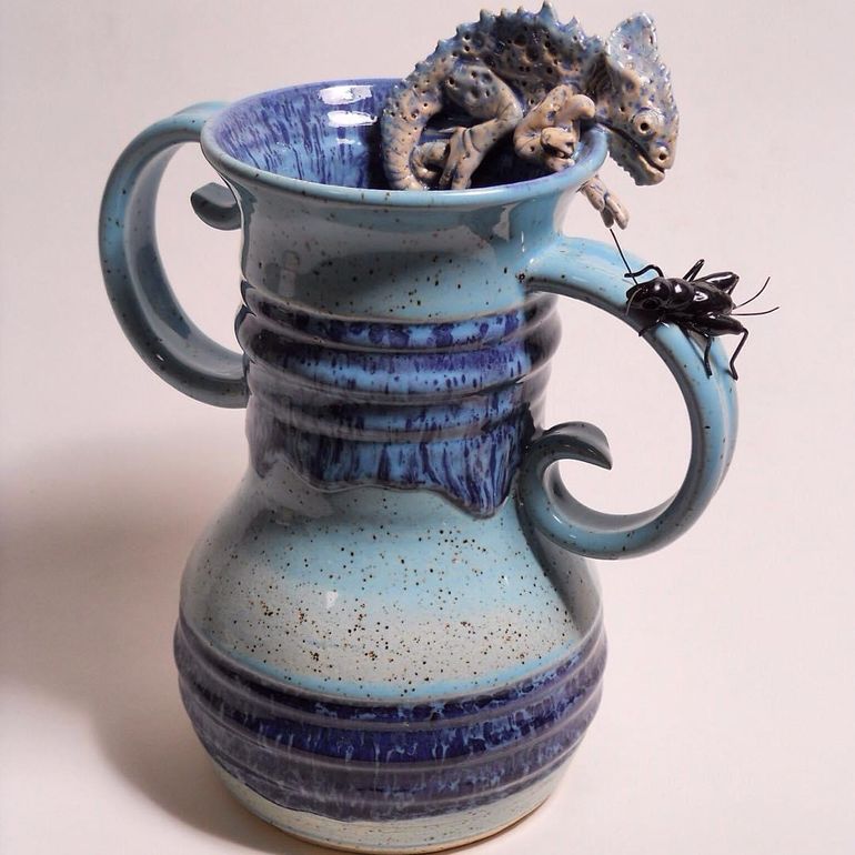
Emphasis—When one area of the design is intended to draw the eye to it, placing it in a position of importance.
The emphasis here is on the interaction between the Chameleon and the Cricket. Normally there would be one point of emphasis, but placing these close together draws your eye to these creatures and the space between them.
Repetition—When an object or objects are used over and over again in the same manner.
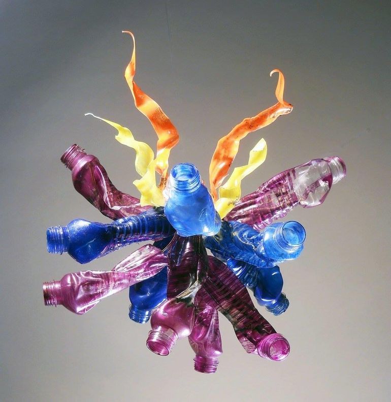
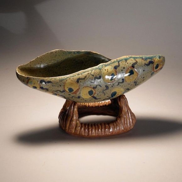
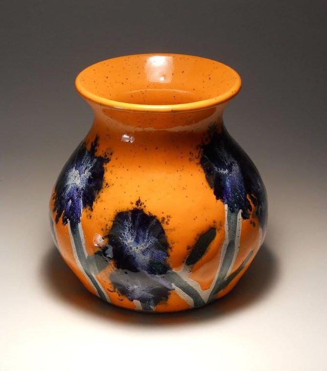
Figure/Ground Relationship—How the foreground and background interact, creating positive and negative space.
The use of the strong orange with the deep blue flowers creates visual tension, while the design is offset by the simple, yet elegant form. You might notice each element differently, but they draw the viewer back and forth into contemplating form vs. pattern and the background and foreground of the glaze used.
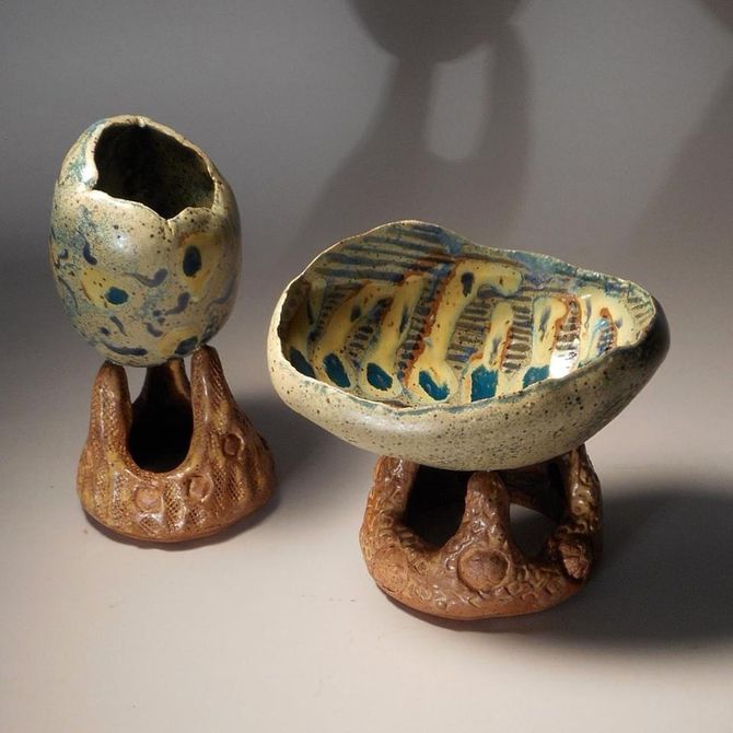
Connection/Juxtaposition—Connection refers to placing objects together to show how they are alike and are similar. Juxtaposition is placing objects together to highlight their differences.
These two pieces show both connection and juxtaposition. The forms are similar but differ in the size of the piece and opening. They use the same glazes and patterns to tie them together.
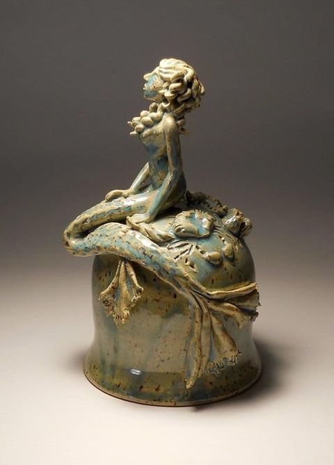
Hierarchy—How visual information is arranged to show importance when conveying information.
For this example, the relatively simple bottom form shows off the importance of the mermaid, specifically, the upper body, while the tail flattens and flows out against the rock .
When Do I Use the Principles of Design?
Quick answer? ALL THE TIME! These principles of design are used across all art media (materials). When you incorporate the third dimension, additional principles come into play, discussed in another guide. As you can tell, they overlap significantly and can be used in an infinite variety of ways together.
Understanding and using these principles in your work will create new and exciting compositions. Whenever you are sketching out a new project, do some quick thumbnails playing with them and trying different ways to combine them. It's a chance to play and learn when to use them to best achieve what you want in your work. 🙌🏽 😄
Browse Study Guides By Unit
🔖Unit 1: Course Overview
🍥Unit 2: Portfolio Design Skills
🤔Unit 3: Portfolio Analysis
💯Unit 4: Exam Rubrics
💡Unit 5: Frequently Asked Questions about AP Art Portfolios
📚Study Tools
👉Subject Guides

Fiveable
Resources
© 2025 Fiveable Inc. All rights reserved.