Dylan Black
AP Microeconomics 🤑
95 resourcesSee Units
Unit 2 in AP Microeconomics is all about supply and demand. Whether it's just drawing the graphs, analyzing consumer and producer surplus, or looking at actions taken in markets, supply and demand form the basis for your entire AP Microeconomics experience. Let's dive into how supply and demand form a market and what that means in economics!
The Demand Curve
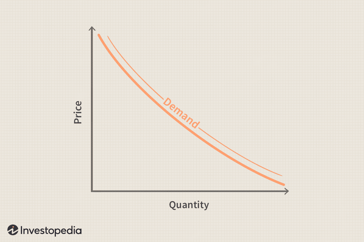
The demand curve for a market is made up of the sum of all individual demands at certain price points. Demand describes the desire buyers have for the product that is in supply. The demand curve is described by the law of demand. This law states that as price goes up, the quantity demanded goes down, and vice versa. This is actually quite intuitive. Think about it like this: suppose you're at a supermarket and an orange sells for $1. Now let's say you go back the next day and oranges are $10! Most people would say that they're going to buy fewer oranges now. This is the law of demand at work! How does this look on a graph? Well, let's take a look:

As you can see, at a high price, the quantity demanded is low. Similarly, at a low price, the quantity demanded is high.
The Supply Curve
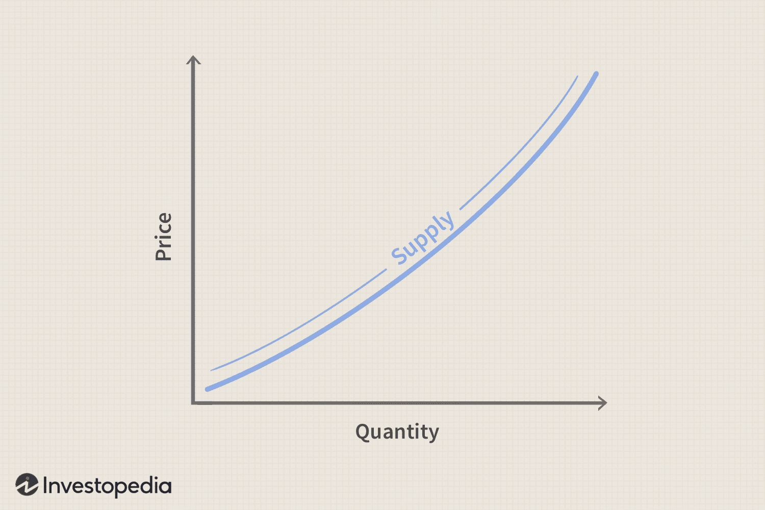
The supply curve for a market is made up of the sum of all individual suppliers at certain price points. Demand describes Describes how much of a given product, resource, or service is available. The supply curve is described by the law of supply. This law states that as price goes up, the quantity demanded goes up, and vice versa. The law of supply can be a little trickier to understand than demand, but that's because simply put, you are not a business, you're a consumer! To businesses, their goal is to make as much profit (and thus revenue) as possible. Therefore, when prices rise, they will output more so that they can make more money. Let's see what this looks like:

As you can see, at a high price, the quantity supplied is high. Similarly, at a low price, the quantity supplied is low.
Quantity Supplied/Demanded vs. Supply/Demand
You may notice that I've used terms like "quantity demanded," and "demand" and "quantity supplied" and "supply" in different places in this article. While they may sound the same, they are different! Quantity demanded/supplied represents the actual NUMBER demanded (the x value of the demand/supply), whereas supply and demand are the actual curves! Why is this important, you may ask? Well, an important thing that happens in AP Micro is that these curves can shift based on certain things that happen (which we discuss in another article). However, when price goes up or down, the curves do not shift!!! Rather, the QUANTITY demanded and supplied will change.
Putting It All Together
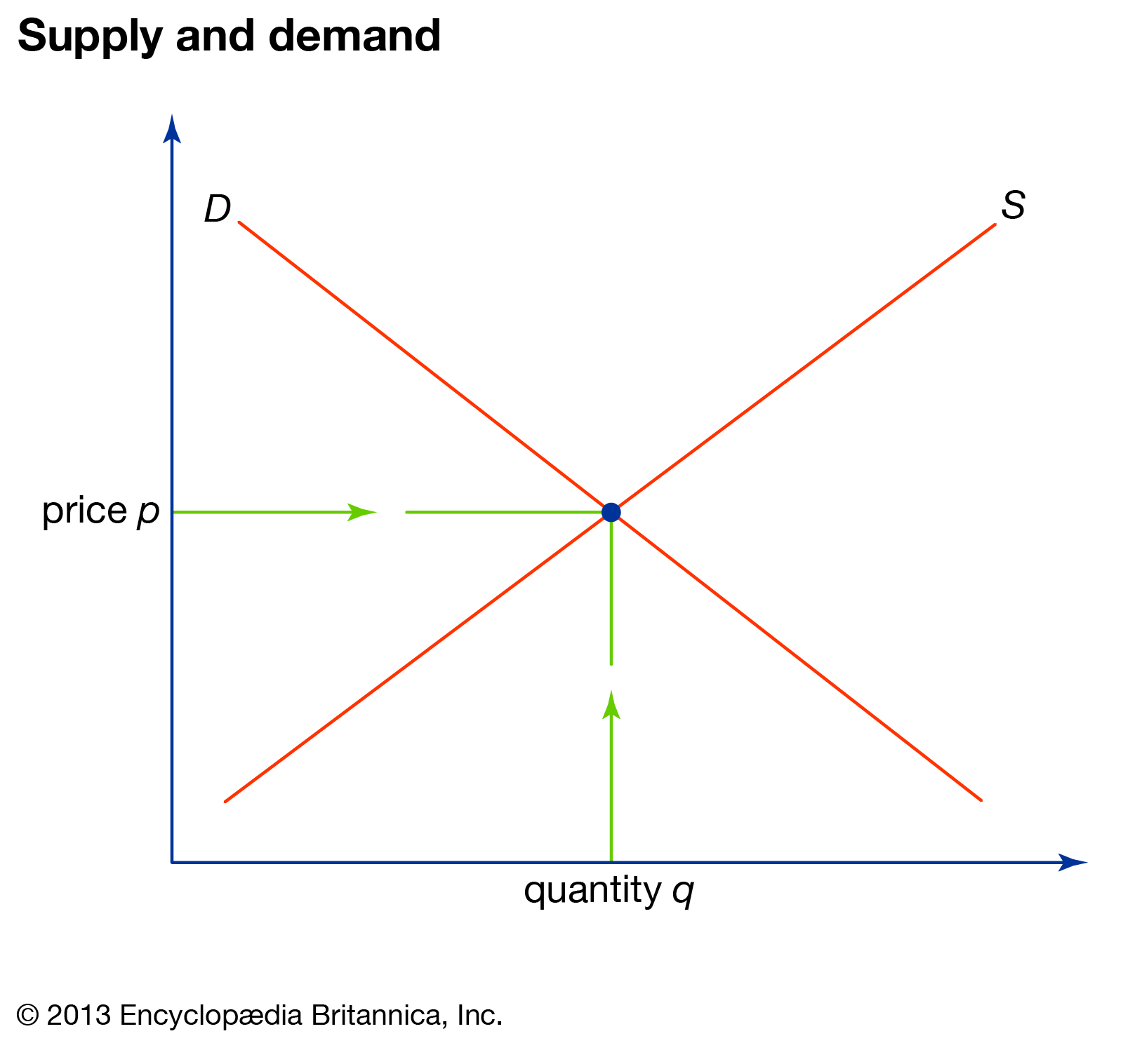
So then, we know that supply and demand are two neat graphs that display consumers and producers in a market. However, let's see what happens when we put them together:

Get very, very, used to this folks, this is most likely the most graphed thing in AP Micro to an extent. What this graph shows is essentially an entire market at what is known as market equilibrium, where the quantity demanded = the quantity supplied. The q and p as shown are known as the equilibrium price and quantity for this market. Supply and demand forms the foundation for AP Micro and leads to further investigation into businesses, firms, and competition!
Browse Study Guides By Unit
💸Unit 1 – Basic Economic Concepts
📈Unit 2 – Supply & Demand
🏋🏼♀️Unit 3 – Production, Cost, & the Perfect Competition Model
⛹🏼♀️Unit 4 – Imperfect Competition
💰Unit 5 – Factor Markets
🏛Unit 6 – Market Failure & the Role of Government
🤔Exam Skills
📚Study Tools

Fiveable
Resources
© 2025 Fiveable Inc. All rights reserved.