1.8 Graphical Representations of Summary Statistics
6 min read•june 18, 2024
Jed Quiaoit
L
Lusine Ghazaryan
AP Statistics 📊
265 resourcesSee Units
As you comb through Unit 1, you're getting more exposure to statistics in the lens of variables and the various ways to represent them in both tabular and graphical forms. After all, graphical representations and statistics allow us to identify and represent key features of data!
This time, we'll take what we know about measure of center and spread to construct graphs that summarize the summary statistics we've encountered so far.
Five Number Summaries
A five number summary provides a concise summary of a dataset. It consists of the minimum value, the first quartile (Q1), the median, the third quartile (Q3), and the maximum value of a dataset. 📝
Remember that quartiles divide the data into four equal sections. One quarter of the data lies below the lower quartile, Q1, while another quarter of the data lies above the upper quartile, Q3. The quartiles border the middle half of the data.
For example, consider the following dataset of 10 numbers:
5, 7, 8, 9, 10, 12, 15, 20, 25, 30
The minimum value is 5, the first quartile (also known as the lower quartile or Q1) is 8, the median is 12, the third quartile (also known as the upper quartile or Q3) is 20, and the maximum value is 30.
So, the five number summary for this dataset is:
Minimum value: 5
First quartile: 8
Median: 12
Third quartile: 20
Maximum value: 30
That's it -- we're done. Yay! 🎉
Five number summaries provide a useful overviews of the range, spread, and central tendency of the data. It is often used in conjunction with box plots, which are graphical representations of the five number summary.
Box Plots
A box plot, also known as a box and whisker plot, graphically represents the five number summary. It is a way to visualize the distribution of a dataset and to identify any outliers or unusual values! 🕵️
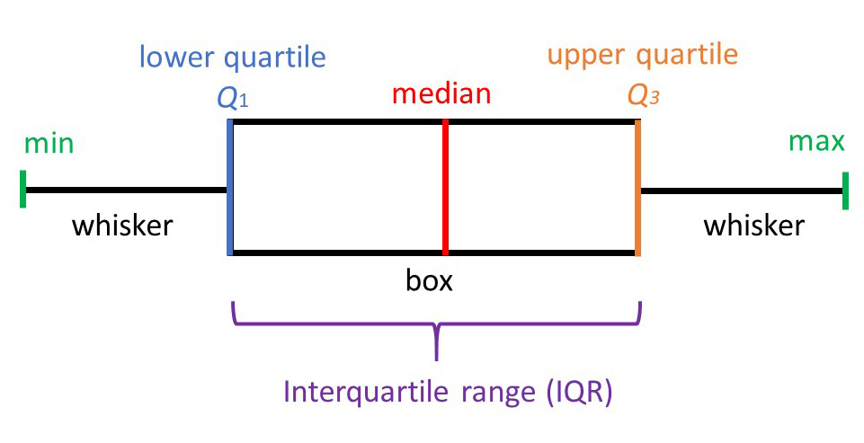
To create a box plot, you start by drawing a horizontal line called the "axis" and marking the minimum, first quartile, median, third quartile, and maximum values of the dataset on it. These marks are then used to create a box shape: the bottom of the box corresponds to the first quartile, the top of the box corresponds to the third quartile, and the line inside the box corresponds to the median.
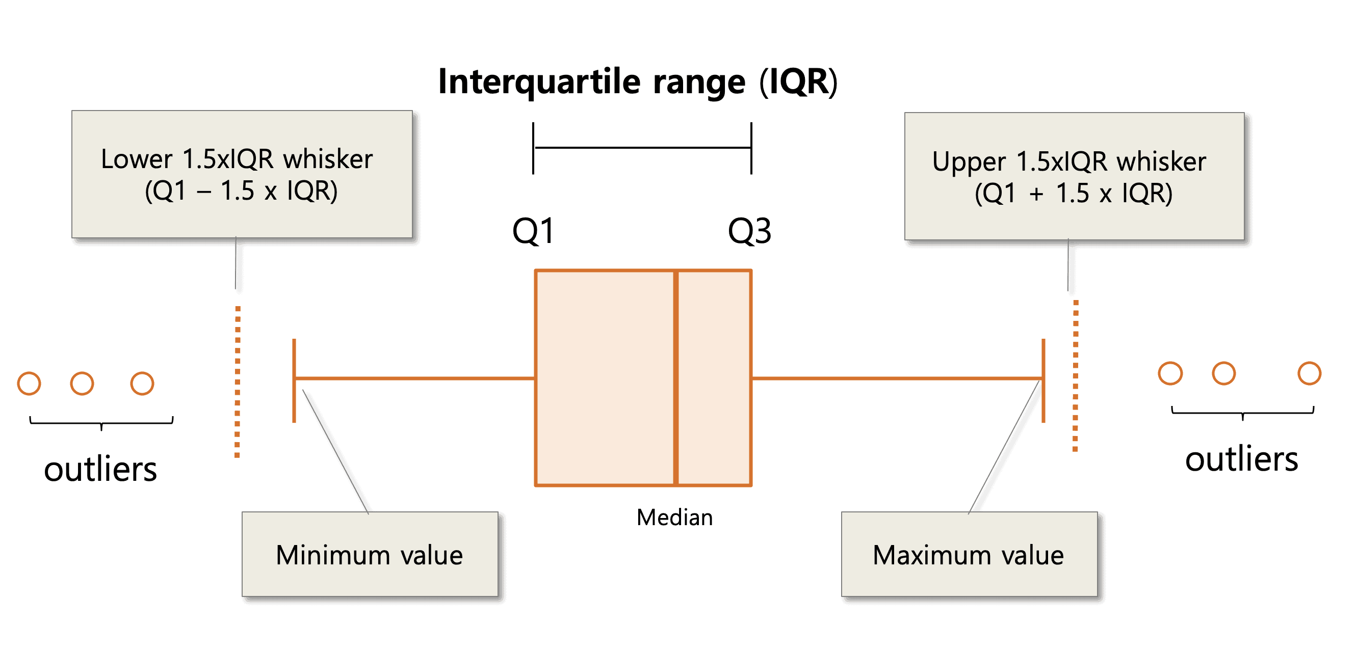
The "whiskers" of the box plot extend from the ends of the box to the minimum and maximum values of the dataset. Any points outside of the whiskers are considered outliers and are plotted separately. 🐭

Source: Simply Psychology
Using the interquartile range, or IQR, we can erect fences to detect the outlier in our data: 🤺
Upper fence = Q3 + 1.5 IQR
and
Lower fence = Q1 - 1.5 IQR
The fences are not included in the box plot, but it helps us to draw the whiskers of the box plot. Any number beyond the whiskers will be displayed in asterisk, indicating that those values are outliers, something that we could hardly know from other quantitative displays.

Source: EzBioCloud
Box Plots and Skew
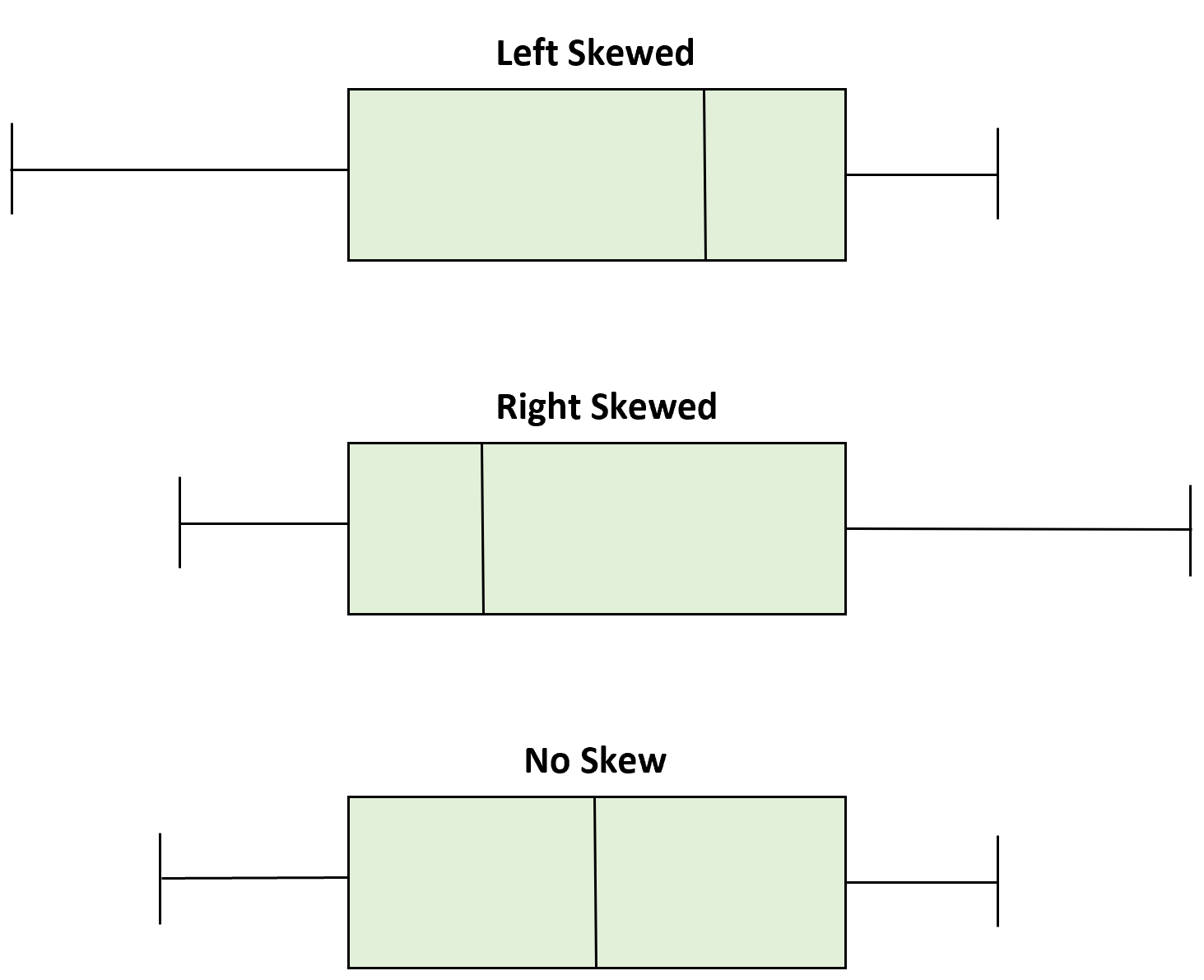
Box plots can help us find important features about the distribution. The central box stretches from Q1 to Q3 and shows the middle (50%) of data. If the median (Q2) is situated in the right middle of the quartiles, then the box will look symmetric. However, we should also look at whiskers. If the whiskers have different lengths, the distribution will be skewed on to the longer whisker’s side. 📏
Still unsure? Here's another way to word the explanation above with a visual as the cherry on top:
To determine whether a box plot is skewed or symmetric, you can look at the position of the median relative to the first and third quartiles.
- If the median is roughly in the middle of the box, with about the same amount of data above and below it, the distribution is symmetric.
- If the median is closer to one end of the box, with more data on the other end, the distribution is skewed.

- Minimum
- Quartile 1 (or First Quartile)
- Median
- Quartile 3 (or Third Quartile)
- Maximum
- Boxplots
- Fences
Practice Questions
(1) Which of the following is NOT a part of a five number summary?
A) Minimum value
B) First quartile
C) Median
D) Range
E) Third quartile
(2) Consider the following dataset of exam scores for a class of 30 students:
75, 80, 85, 85, 90, 90, 90, 95, 95, 95, 95, 95, 95, 100, 100, 100, 100, 100, 100, 100, 100, 100, 100, 100, 100, 100, 100, 100, 100, 100
A. Create a five number summary for the dataset.
B. Create a box plot for the dataset.
C. What can you conclude about the distribution of the exam scores based on the five number summary and the box plot?
(3) A researcher is studying the heights of a sample of 100 adults. The five number summary for the sample is:
Minimum value: 150 cm
First quartile: 160 cm
Median: 170 cm
Third quartile: 180 cm
Maximum value: 200 cm
Is a data point with a height of 220 cm considered an outlier according to the 1.5 x IQR rule?
Answers
(1) D) Range. A five number summary consists of the minimum value, the first quartile, the median, the third quartile, and the maximum value of a dataset. The range, which is the difference between the minimum and maximum values, is not a part of the five number summary.
(2) A. To create a five number summary for the dataset, you need to calculate the minimum value, the first quartile, the median, the third quartile, and the maximum value.
The minimum value is 75, the maximum value is 100, and the median is 95. To find the first quartile (Q1), you need to find the median of the lower half of the dataset. The lower half of the dataset consists of the first 15 scores, which are:
75, 80, 85, 85, 90, 90, 90, 95, 95, 95, 95, 95, 95, 100, 100
The median of the lower half of the dataset is 90. To find the third quartile (Q3), you need to find the median of the upper half of the dataset. The upper half of the dataset consists of the last 15 scores, which are:
95, 95, 95, 95, 95, 95, 100, 100, 100, 100, 100, 100, 100, 100, 100
The median of the upper half of the dataset is 100.
Therefore, the five number summary for the dataset is:
Minimum value: 75
First quartile: 90
Median: 95
Third quartile: 100
Maximum value: 100
B. I'll leave it up to you to draw the box plot and get some practice. 😉
C. Based on the five number summary and the box plot, you can conclude that the distribution of the exam scores is skewed to the right, with a long tail of high scores. The median (95) is closer to the left side of the box, with more data on the right side. This indicates that there are more high scores in the dataset than low scores. The minimum value (75) and the first quartile (90) are also relatively low, indicating that there are a few low scores in the dataset. Overall, the distribution of the exam scores is skewed to the right, with a long tail of high scores and a few low scores.
(3) To answer this question, you need to calculate the interquartile range (IQR) of the sample. The IQR is the difference between the third quartile and the first quartile, and is a measure of the spread of the data. In this case, the IQR is 180 cm - 160 cm = 20 cm.
According to the 1.5 x IQR rule, a data point is considered an outlier if it is more than 1.5 times the IQR below the first quartile or more than 1.5 times the IQR above the third quartile.
In this case, the data point with a height of 220 cm is more than 1.5 times the IQR above the third quartile (180 cm), so it is considered an outlier.
The correct answer is: Yes, a height of 220 cm is considered an outlier in our data set! (Notice how we didn't need the raw dataset or the box plot to determine whether a data point is an outlier or not? The five number summary definitely suffices in providing enough information and context.)
Browse Study Guides By Unit
👆Unit 1 – Exploring One-Variable Data
✌️Unit 2 – Exploring Two-Variable Data
🔎Unit 3 – Collecting Data
🎲Unit 4 – Probability, Random Variables, & Probability Distributions
📊Unit 5 – Sampling Distributions
⚖️Unit 6 – Proportions
😼Unit 7 – Means
✳️Unit 8 – Chi-Squares
📈Unit 9 – Slopes
✏️Frequently Asked Questions
📚Study Tools
🤔Exam Skills

Fiveable
Resources
© 2025 Fiveable Inc. All rights reserved.