1.3 Representing a Categorical Variable with Tables
4 min read•june 18, 2024
J
Jed Quiaoit
L
Lusine Ghazaryan
AP Statistics 📊
265 resourcesSee Units
Data can be enormous and hard to understand when observed in its raw, unprocessed likeness. For this purpose, statistics was created to help us organize and analyze data. First, values are organized in tables; then, data are graphed in different displays.
Tables are a necessary step to start analyzing data, but it may fail to highlight essential features with data. The graphical displays are visually attractive, easy to read, and see important patterns of the distribution. For categorical variables, the choices are limited. Bar graphs and pie charts are the most common displays when looking at data in chart-like formats. 🪑
Frequency Tables
Let's say we just finished sending out a survey to our AP Statistics class on how stressful being a student is as a hypothetical occupation with our categories being "very," "somewhat," and "none" (not stressful at all). We, then, have collected 30 responses. How do we organize these responses and make sense of them? 🤔
One way to do so is to “pile” the data by counting the number of data values in each category of interest. From there, we can organize these counts into a frequency table, which records the totals and the category names.
At this point, you might wonder: "Wait, what's a frequency table?"
A frequency table for qualitative data lists all categories in one column and the number of elements that belong to each of the categories on the next column. Tallies (e.g., ||||) can be used to number the raw data. The frequency table has the following look:
Source: Prem S. Mann. Introductory Statistics. John Wiley and Sons Inc. 2010
The variable is stress on job, which assumes three categories; very, somewhat, and none. Since there is some order, stress on job can be ranked as an ordinal variable. The frequency table always reports the sum of the frequencies that makes up our sample. 🧮
Extension: Relative Frequency Tables
The concept of frequency tables can be extended using relative frequencies and percentages.
- The relative frequency is found by dividing the frequency for each category by the sum of all frequencies.
- The percentage is obtained by multiplying the relative frequency of category by 100.
Relative frequency of a category = Frequency of that cat category / Sum of all frequencies
Percentage = Relative frequency * 100
With these quantities in mind, a relative frequency table is similar, but it gives the percentages for each category instead of counts. Based on the relative frequency and percentage distributions of stress on job, we can state that the 33.3% of the employees answered that their jobs are very stressful. Another way to interpret the data is by combining the groups "very" and "somewhat" stressed and report that 80% of the employees answered that jobs are very or somewhat stressful. ✅
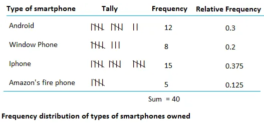
The image below shows the difference between frequency and relative frequency. Unlike frequencies which typically add up to whatever total count of items/respondents there are, tThe sum of the relative frequencies should be 1.00 or close to 1.00 if the relative frequencies have been rounded. Similarly, the sum of the percentages is always 100 or close 100 if the percentages have been rounded as well.

Source: Basic Mathematics
Summary
- A frequency table is a list that shows how often each value occurs in a set of data. It shows the number of times (or frequency) that each value appears in the data.
For example, consider the following data set: 2, 3, 3, 5, 5, 5, 7, 7, 9. A frequency table for this data set would look like this:
Value ---- Frequency
2 ---- 1
3 ---- 2
5 ---- 3
7 ---- 2
9 ---- 1
- A relative frequency table is similar to a frequency table, but it shows the relative frequency of each value in the data set. This means that the frequencies are expressed as a proportion of the total number of values in the data set.
For example, the relative frequencies for the data set above would be:
Value ---- Relative Frequency
2 ---- 0.1
3 ---- 0.2
5 ---- 0.3
7 ---- 0.2
9 ---- 0.1
- The sum of the relative frequencies in a relative frequency table is always 1.
🎥 Watch: AP Stats - Analyzing Categorical Variables
Browse Study Guides By Unit
👆Unit 1 – Exploring One-Variable Data
✌️Unit 2 – Exploring Two-Variable Data
🔎Unit 3 – Collecting Data
🎲Unit 4 – Probability, Random Variables, & Probability Distributions
📊Unit 5 – Sampling Distributions
⚖️Unit 6 – Proportions
😼Unit 7 – Means
✳️Unit 8 – Chi-Squares
📈Unit 9 – Slopes
✏️Frequently Asked Questions
📚Study Tools
🤔Exam Skills

Fiveable
Resources
© 2025 Fiveable Inc. All rights reserved.